As mentioned in the previous blog post, to overcome the "Covid-19 blues," I headed for my childhood home in the New Mexico mountains. For this trip, I took a box of large stretched canvasses and my acrylic paints.
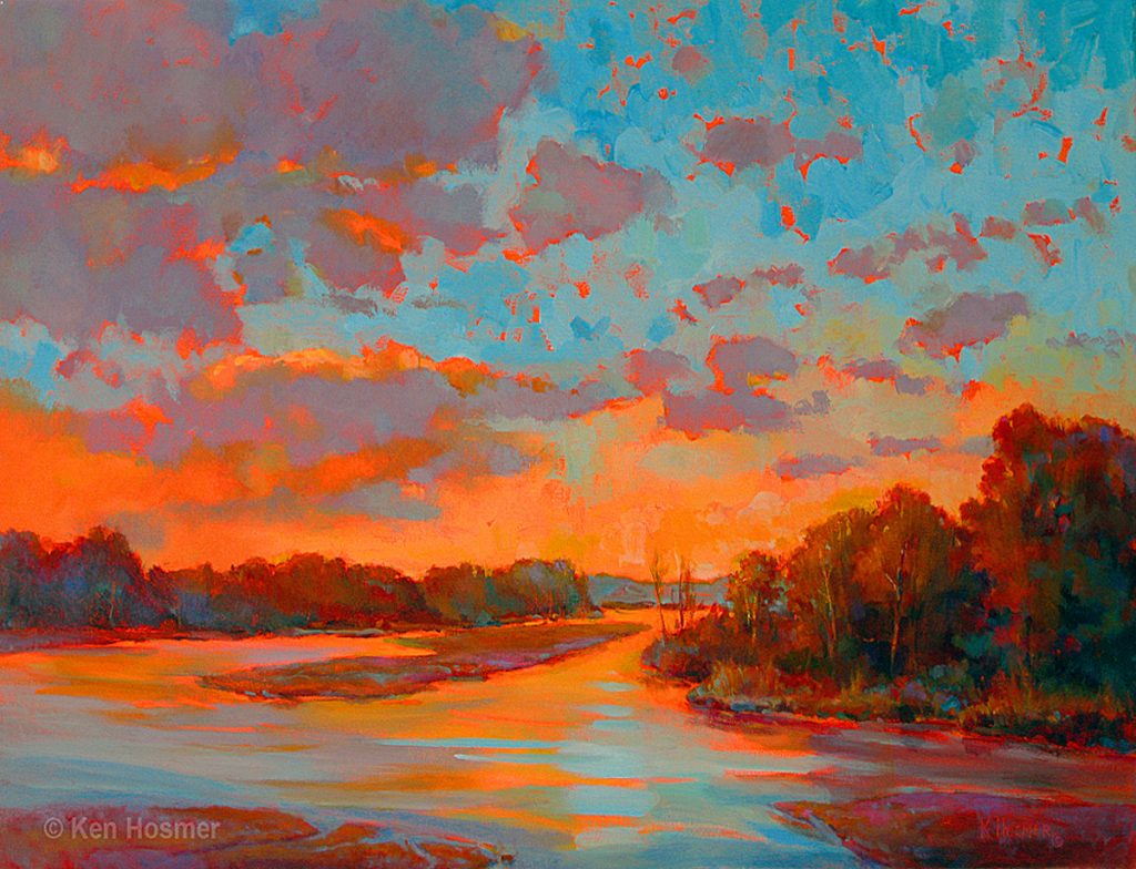
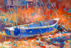
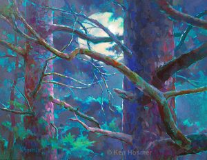
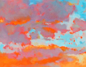
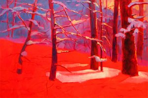
Although the subjects I painted were varied, each acrylic canvas shared a common denominator—a brightly colored ground. Selecting this color has become a personal fascination. When planning a new painting, I consider many options such as red, red-orange, turquoise, green, magenta or other background tones.
Painting the Ground
I start with a white canvas. Then a coat of artist acrylic paint is applied and thoroughly dried. The idea is to have a background color which will not be disturbed during the painting process. For a transparent ground, I thin the paint with a small amount of water or acrylic airbrush medium. To opacify or lighten the color, I add white to the mixture.
For oil paintings, on acrylic gesso primed canvas panels, I also use thinned acrylic paint. On oil primed canvas, I use alkyd paint for the ground, as this is compatible with traditional oils and dries in several days.
Color Choices
Once I pick a major color dominance for the painting, I often choose an opposite color temperature or complementary hue for the ground. So for example, if the painting has warm red flowers, I might choose a cool color such as green or turquoise for the ground. If I plan a landscape which has a dominance of greens and blues, I might begin with a background of red or orange. However, it is sometimes best not to overthink the process. I may select a background color simply because it feels right.
Years ago when I first began exploring this technique, I mostly used softer tones; with time, background color choices have become much bolder. It is very exciting to begin with a bold color, and see how this influences the final look and mood of a painting.
Color Harmony
One of the great benefits of this technique is that it easy leads to color harmony or unified color. I leave random bits of background hue showing throughout the painting, a technique called broken color, which visually ties the painting together. Also, I often thinly apply the final paint allowing the underpainting to show through. This can be beautifully subtle and again contributes to color harmony by creating visual color blends and repeating a common hue.
Other Helpful Tips
The underpainting color generally works best when it falls in the mid-value range.
Because a vibrant background color makes it difficult to judge value, I strive to block in large areas of the painting as soon as possible. To aid in seeing value relationships more accurately, I often begin with at least one dark area and one light area applied to the mid-value background.
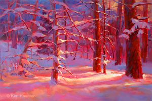
When I teach this method in workshops, one of the most common errors is that students cover up too much of the background color. To overcome this, I suggest leaving extra background color around the edges of objects. Also we can lift paint, re-exposing the background color.
Have fun with this valuable technique. It's a great way to add color excitement to an otherwise ordinary painting subject, create mood, and achieve color harmony.
