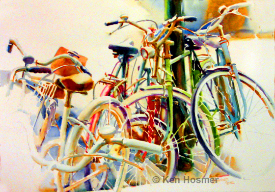
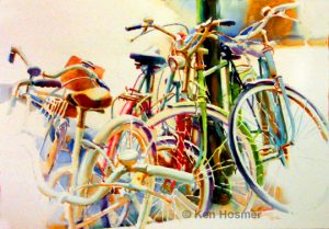
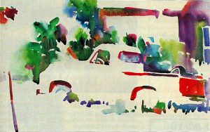
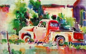
How To Paint Backward

Cycles-watercolor painting by Ken Hosmer

Magazine Article

Some time ago I wrote a magazine article, describing my non-traditional way of applying watercolor. The method works great and I still use it today. It's worth sharing again.

Featured painting:
'Cycles'—watercolor by Ken Hosmer

HOW TO PAINT "BACKWARD"
By Ken Hosmer
copyright 1994

This article originally appeared in The Artist’s Magazine Special Issue, WATERCOLOR MAGIC, Summer 1994.

It’s no doubt unconventional, but painting from dark to light can give you deep rich results.

If you’re after rich, dripping darks, pure color and brilliant lights, then you might consider trying this dark-to-light approach to watercolor. This system calls for painting the darkest darks first, sliding into the middle values, and saving the lights as stark white paper. In addition, there’s no need to premix paints. Just lay in pure, intense colors and let them mix on the paper.

The traditional method of applying watercolor begins with light washes and builds with darker layers of paint. But this approach has several inherent drawbacks. First, the darks often become muddy and lose their spontaneity through the layering process. Second, the lightest lights are applied first, often too heavily, covering too much white paper. This lowers the value of the lights, and they never really "pop." But painting in reverse order, "backward," if you will, takes care of these problems.

The Marker Sketch
When I paint, I think in terms of only three basic values: light, mid-value and dark. The marker sketch (see Steps One and Two) provides this simplified pattern. It serves as a map, providing a basic arrangement of shapes and tells me where to place the boldest darks and strongest lights.

I use a felt marker with a brush-type nib and water-soluble ink on a pad of Bristol paper. I start by inking in the darkest shadows of my subject. To force myself into a right-brained approach, I begin in the center of the paper and work my way from one dark shape to the next across the paper. This creates a pathway of dark masses.

At some point in this process, I choose my composition by selectively moving a mat around the page, looking for intriguing arrangements. Additional dark shapes are then added to enhance the pathway that should lead the eye through the picture. This method of designing allows maximum flexibility, and one marker sketch sometimes can be used for several variations of a painting. If I don’t like part of the composition, it’s easily changed by moving the mat.

'Cycles' watercolor painting by Ken Hosmer

Marking Transitions
In Cycles (22x30), the practice of marker sketching allowed me to simplify an extremely complex subject. Each dark shape negatively creates numerous light shapes, forming beautiful transitions between the positive and negative.

hosmer-step1

Step One
I begin near the center of interest and ink the darkest shadows. Rather than "jumping around," I work from shape to shape, creating a pathway of dark shapes as I cross the page. I prefer to use almost no preliminary pencil drawing, as the marker forces me to react intuitively to shapes. This sketch was begun in the center of an 11 x 14 sheet of Bristol paper. The position of the subject was then manipulated using a 5 x 7 mat.

hosmer-step2

Step Two
With a soft brush and clear water, I drag through the water-soluble ink to create mid-value areas, saving the lightest areas as pure white paper. This sketching method generates a wonderfully simplified pattern using only three values. And because the sketch is so similar in character to watercolor painting, it provides the ideal reference source.

Step Three
After the subject is further cropped, I make an outline drawing on watercolor paper and paint in the darkest darks. I work to build the same basic pattern as the ink sketch, laying in pure pigments side by side and allowing water to mix the colors. Because I know where the darks belong. I'm free to experiment with color transitions.

Step Four
While the darks are still slightly wet, I add mid value areas, allowing the moisture to soften edges as I paint. As in the ink sketch, the light areas are saved as pure white paper. I then color -tint the light areas, trying to keep them as light as possible.

The Painting
I use a standard No. 2 pencil to draw an outline of the subject on watercolor paper. I draw not only the subject, but also edges of dark shadow shapes and background shapes. Although minor changes are made as I paint, the idea is to hold to the original design.For my palette, I select transparent colors high in tinting strength. I prefer these staining colors to heavier, more granulated pigments because they can be lifted to a lighter value with a sponge without damaging the fresh quality of the original wash. Because I do little mixing on the palette, I use tube colors that form a complete cycle around the color wheel. My palette includes transparent yellow, quinacridone gold, perinone orange, quinacridone burnt orange, red rose deep, quinacridone violet, carbazole violet, French ultramarine, Winsor blue GS, phthalo green BS, and sap green. (Colors updated since original publication.) All are selected from brands with a lightfast rating of ASTM I or II.

Before painting, I thoroughly wet the back of the paper and then the front. I blot the front dry with a towel, and then attach the paper to the board. For my purposes, this procedure produces the optimum degree of wetness. The paper now has a fairly dry surface for control of hard edges, and yet the paint easily flows onto the paper with no drag or resistance. The water trapped underneath the paper "feeds" the surface moisture, slows the drying process and allows more time to paint before the washes dry.I begin by painting in the dark-value areas. A good place to start is usually on a background shape behind the subject. I move into the darks within the subject and work across the page, exactly as I did in the ink sketch. As I proceed, I soften some of the edges with water.The darkest darks will lighten considerably as the paint dries, based on the amount of water used and the size of the area. So the darks will actually dry with some variation of value. However, by thinking in terms of only one basic value, the painting process is considerably simplified, and each painted area is kept in the correct "ballpark" value range. This idea also applies when painting the mid-value and light areas. Also note that the darks in the watercolor painting will be more luminous if they are somewhat lighter than the "super dark" of the black marker in the sketch.

While the dark areas are still partially wet, I paint the mid-value areas. In most cases, pure colors are laid in side by side on the wet paper, allowing water to mix the colors naturally by diffusion. I'll often add new pigment or simply drag pigment from the existing dark areas. The trick is to maintain just the right amount of water in the brush. More water creates exciting runs, while less water allows more control. As I experiment with water and color transitions, I remind myself to hold to the mid-value range. Also, I try to save plenty of white paper for my lights, because at this stage it's easy to cover too much white paper.The painting is now nearly complete. The light areas sparkle with the brilliance of sunlight. But often, some lights will appear too cold and some too white. I want to color-tint or glaze these areas without losing their sparkle. I often begin with a thin glaze of yellow-orange to add warmth. Then I add thin washes of other pure colors. The object is to leave some clean white paper and to add color while keeping the area as light as possible. With fine tuning, the painting is now complete.
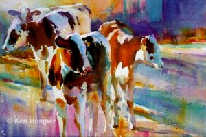
Intuitive Color
By focusing on a simplified value system, I'm free to use color intuitively. If the value relationships are correct, almost any color will work. I also keep in mind the color shifts of objects as they move from light to shadow, and how color is influenced by "bounce" light--the color of one object bouncing into the shadow of the object next to it.Overall, painting with watercolor is a balancing act between spontaneity and control. Building a painting traditionally, in layers, offers control, but often sacrifices freshness. But painting dark-to-light, in one application, wet-in-wet, as I do, produces maximum spontaneity and captures the intrinsic beauty of pure dripping paint diffusions. Although this direct approach is a bit more difficult than the traditional, with a little practice, you'll find the results worth the effort.For more information about Ken Hosmer please visit his web site:www.kenhosmer.com

Paint Backward

Dripping Darks
In Spring Calves (15 x 22), pure, vibrant colors seem to magically drip into place, forming the illusion of cattle. The cleanest, richest darks are the ones painted boldly over white paper and never retouched with the brush.
Share