A Medley of Ink Sketches
Value as a Colorist
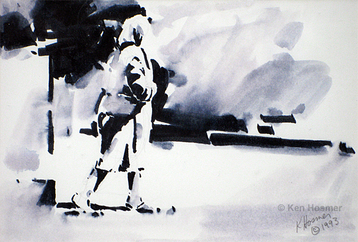
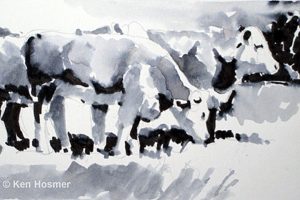
By definition value is the lightness or darkness of a color. When I begin a painting I already have a value plan in place via the preliminary ink sketch. This serves as my primary painting reference. I use the ink sketch to plan my design and provide a simplified three-value map of darks, mid-values, and lights.
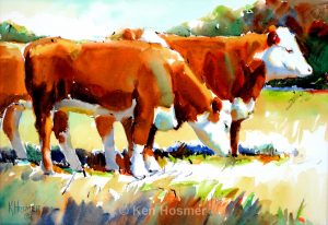
As an artist, I am considered a colorist. The ability to develop unique color choices, largely depends on a firm understanding of an image's underlying value structure. So as I create the final painting, this understanding of value gives me color freedom—the freedom to exaggerate or totally change both the hue and intensity of the subject's original color, the freedom to invent new color combinations as I paint, the freedom to react to color emotionally.
Thus the black and white sketch is a valuable tool for developing strong color. In most paintings, I hold to the value structure of the ink sketch and play with color hue and color intensity as I paint. For me, this playful manipulation of color brings me great joy and is at the heart of the artistic process.
Inking Procedure
Basic supplies include a water soluble black marker (Tombow N15), ordinary #2 school pencil, bristol paper, and a pointed watercolor brush. After doing a quick pencil outline, I draw in all the darks with the marker. Next, with a moist or wet brush, I borrow ink from the darks to create the mid-value grey areas. I work around lights which are left as white paper. The technique is quite simple and is a great learning tool. I use this method working from either real life or from photographs.
Translating the Value Map into Watercolor
The white paper in the ink sketch is kept as white paper in the watercolor painting. These areas are marked in pencil on the watercolor paper, and saved as white paper until the very end of the painting. As a final step, some of the larger white paper areas may receive a very light tint of color.
The black areas in the ink sketch are translated as the darkest values in my painting. The super darks from the ink pen look great in a black and white drawing, but when these areas are translated into color, they need to be lightened enough with water so that the watercolor maintains its transparency.
The designated mid-values in the ink sketch become the mid-value areas in the watercolor. Although as I paint, I am free to shift the mid-values slightly lighter or darker as dictated by the subject.
As a final check, I compare the ink sketch to the completed painting and ask myself two questions. Do they both have three distinctive value areas: dark, middle, and light? Does the watercolor painting echo the same value plan portrayed in the black and white sketch?
For more details on the ink sketch process, please refer to my art-blog.
How to Plan Your Painting.
