Pros and Cons of Plastic Palettes
When I began painting in watercolor, and for many years, I used a heavy plastic Melmac serving plate from the kitchen as my palette. It had raised edges, a large mixing area, and worked great.
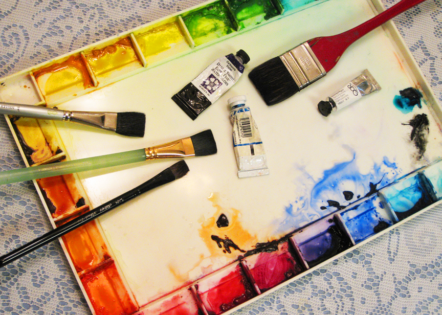
Today there are a wide variety of manufactured plastic palettes available for watercolor. My preferred choice is the John Pike Big Well Palette. It has 18 wide wells and a snap on lid (which can also be used for color mixing).

There are two main reasons that I have chosen this palette. First, it is made of a dull-finish white plastic which is an ideal surface for spreading washes. Many of the other plastic palettes have a very glossy finish which causes the water to bead up, rather than spread evenly. It is essential to spread the diluted color in the open area of your palette in order to judge the value (lightness or darkness) of the pigment before you apply it to the paper.
Secondly, the Pike palette has shallow wells which enable the paint to slide easily into the open mixing area. Many of the palettes have very deep wells which make it more difficult to slide the color out and cause excess water to build up in each well. If you have too much water in your paint, it is more difficult to control the pigment flow in your painting.
Arrangement of Colors
I prefer to arrange my colors around the palette similar to the color wheel: yellow, orange, red-orange, red, red-violet, violet, etc. This is useful because as I paint, I often swing around the color wheel, changing from one analogous color to the next.
Some artists place warm colors on one side of the palette and cool colors on the other. Some place the neutral colors together. So there are several alternative choices. Choose the one that best fits the way you paint.
Also, if you have extra wells, it is good to periodically skip a space as you arrange your colors. This way you have spaces to add new colors later.
Selecting Colors
Although the many color choices can be overwhelming, the main consideration is to choose a limited set of colors that will allow you to mix any desired hue around the color wheel, without gaps. For example, if you cannot mix a bright yellow-orange with the tube colors you have chosen, then you have a "dead spot" in the color wheel, and perhaps need to add a red-orange pigment such as Pyrrol Orange to your palette. The newly added pigment will combine with yellow to give you the desired bright yellow-orange—filling the color gap.
You may notice that I have eliminated the traditional neutral tube colors, such as Raw and Burnt Umber, black, Raw Sienna, and Yellow Ochre. My only remaining neutrals are Quinacridone Burnt Orange (which replaces Burnt Sienna) and Quinacridone Gold; these are both very transparent. I can easily mix the other neutrals as needed. Many artists still include a wide range of neutral pigments on their palette, so reducing the number of neutral tube colors is a personal choice.
Ideally, I want my selected pigments to be transparent, have strong tinting strength, and be non-fading or permanent.
Transparency
Opaque colors, such as Cadmium Red, perform well in watercolor when used alone. However, when you combine opaque pigments with other colors, they can result in a dull or muddy mixture. Transparent colors on the other hand, result in clean color blends, even when mixing complementary colors to get neutrals. So selecting transparent pigments, provides a great advantage when painting in watercolor.
Tinting Strength
When I began watercolor painting in 1970, the Phthalo Blue and Phthalo Green pigments overpowered the other colors. These had such strong tinting strength, that they were extremely difficult to control. Today, especially with the addition of Quinacridone pigments, we have a good variety of colors with strong tinting strength. The result is a much more balanced palette with greater color vibrancy.
I prefer the strong tinting colors as my painting style dictates. Be aware that many paint brands offer a student grade paint at a lower price. These often have weak tinting strength when compared to professional quality paints.
Permanency
The American Society for Testing and Materials (ASTM) rates pigments based on how durable they are when exposed to ultraviolet light. The rating system utilizes Roman numerals from 1 to 5 (I to V), with "I" being the most lightfast or permanent, and "V" being the most fugitive or fading. For art work, it is best to use only pigments rated as ASTM Lightfastness I or II.
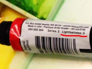
Over the years I have not used several otherwise desirable colors because they were prone to fading. Look on the paint tube for the lightfastness rating.
Pigment Numbers
Paint manufacturers create a variety of color names for each pigment. So it is best to refer to the pigment number which is often on the manufacturer's or seller's website, or in the fine print on the tube of paint. The pigment number allows you to identify the actual pigment content of a tube, lets you to cross reference between brands, and helps to avoid much confusion.
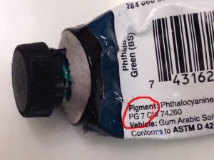
For example, a tube with the pigment number "PG7" (pigment green number 7) might be labeled Phthalo Green, Winsor Green, Joe's Green or Viridian, by different paint manufacturers. These are all made from the same (PG7) pigment. It is very annoying to buy a new color, only to discover later that it is identical to one you already have under a different name.
Basic Palette of Colors
If you are just starting out, here is a basic selection of six excellent colors chosen from my full palette of Daniel Smith brand paints. Please see my workshop supply list (link below) for other brands and the various pigment names under which they are sold.
PY97 Hansa Yellow Medium
PO48 Quinacridone Burnt Orange
PO73 Pyrrol Orange
PV19 Quinacridone Rose
PB29 Ultramarine Blue
PG7 Phthalo Green (BS)
In conclusion, there are many fine watercolor pigments available to fill your palette. Each artist seems to have their own favorites and each manufacturer tries to encourage you to buy more colors. So selecting just the right set of colors to fit your painting needs can be a challenge.
Additional Pigment Information:
My current watercolor supply list
Handprint.com (guide to watercolor pigments)
