
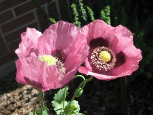
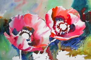
Photo Reference
Since the poppies aren't blooming yet, I find one of my old photos. On dry watercolor paper I complete my drawing with a #2 pencil. In the drawing, I shift the angle of the left poppy to make it more pleasing and zoom in to allow the flowers to fill a larger part of the picture area. My photo reference shows me the flower structure, but I am free to make many changes—more red in the poppies would be nice!
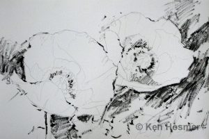
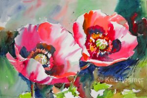
Black Texture Drawing
Now for the fun part. On dry watercolor paper, with a wooden stick or Q-tip cotton swab dipped in black acrylic paint, I quickly lay in a high energy scribble drawing on top of the pencil outline. The black is used as textural shading in the background and in the flower centers. Once the black acrylic is dry, it remains undisturbed when watercolor washes are applied over it. This is a great way to begin a painting, as it lets me play with random lines and loosen up.
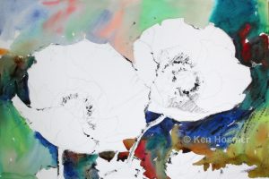
Paint the Background
In floral paintings, I like paint the background first. This sets the poppies, stems, and foliage off as white negative shapes. The background is divided into mid-value shapes and dark shapes. A large dark shape is positioned behind the right poppy to set it off as the main center of interest. Also notice that I included some red areas in the background as a repeat of the flower color. This will help to visually tie the flowers to background.
Develop the Flower Centers
Next I paint the darkest dark areas in the center of each flower, negative painting around the lighter shapes. Take some time to refine these shapes, as the flower centers are like the eyes in a portrait. The viewers attention will naturally focus there. In this case I am using dark red, laced with a little cool blue from the background.
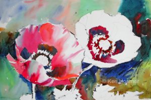
Paint the Petals
After the dark centers dry, I begin flowing coloration into the petals. I basically want to paint the shadows on the flower petals with mid-value colors: pink, red, and red-orange. I leave areas where the light hits as pure white paper. The white on the petals is a very important part of the design, so leave extra white, avoiding the temptation to cover it up.
Also most flowers contain form shadows with soft edges, so make sure to soften edges between the shadows and light areas. I achieve this by quickly coming back to freshly painted areas, and lifting paint from the edge with a moist brush.
Finally notice that I mixed a small amount of soft green into some of the petal shadows. This harmonizes the flower with the background. If you forget this small but important step, it is easy to wash a bit of background color into the flowers after the painting is dry.
Finish the Centers and Stems
After the petals are dry, I go back and complete the poppy centers, by adding mid value washes and leaving white only where the light hits the centers. Notice on the front left flower how I leave the front petal lighter, and push the center darker so that it recedes, letting the front petal pop forward. This is also an opportunity to playfully add a variety of colors into the centers. If any of the dark areas dried with too hard of an edge, it is easy to soften edges by rubbing with a moist brush.
At this point I also paint mid-value shadows on the stems and leaves. Notice that I have included some red in the stem and foliage areas.
Make Final Adjustments
Before I finalize a painting, I usually like to take a break and get away from the image for about an hour. Then I come back and look again with a fresh eye. Often I add more small bits of color—hard to resist because I love to play with color.
In this case, I thought the upper mid-value background area was a little plain. So I added another light wash of ultramarine blue to the upper left tilting the painting board vertically to encourage the wash to flow and granulate as it dried. Then I added a bit more black acrylic texture to the left area. Finally, I decided to pop the warms, by adding yellow-orange washes to flower centers, several petal areas, and to the lower foliage area.
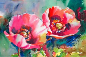
Mood
I don't want my poppies to feel stagnant, but rather I want them to have the feeling of movement as they bravely face the summer breeze.
